


Color Pop Paradise: Energize Your Space with Bold Summer Hues
Discover how strategic splashes of vibrant color can instantly transform any room from ordinary to extraordinary
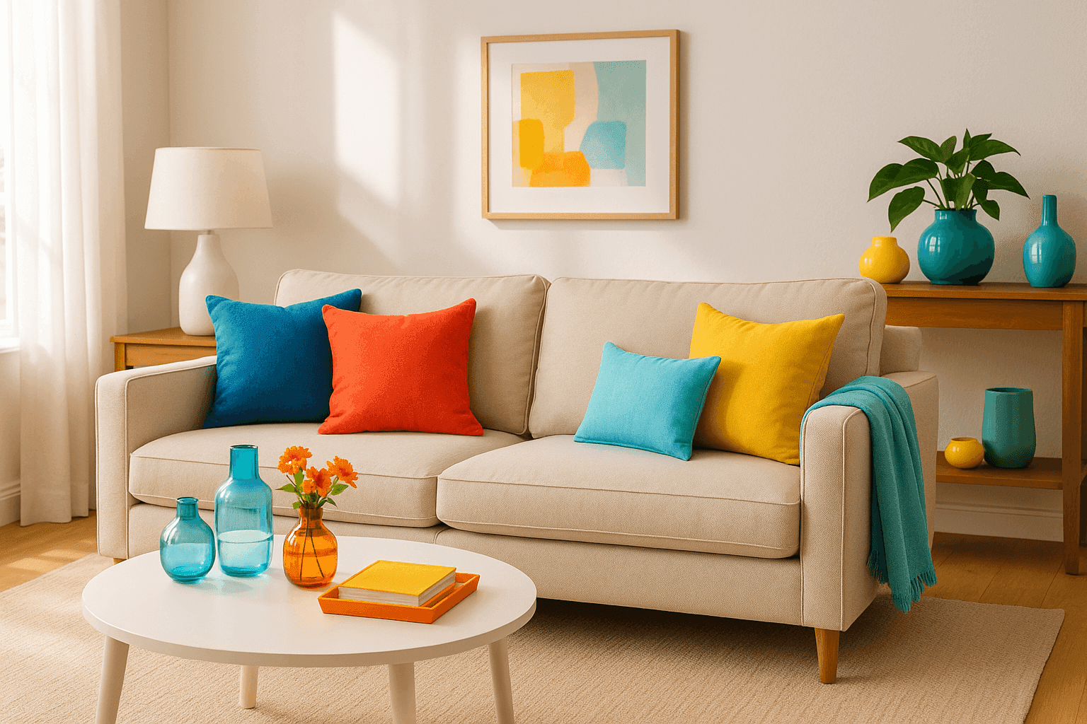
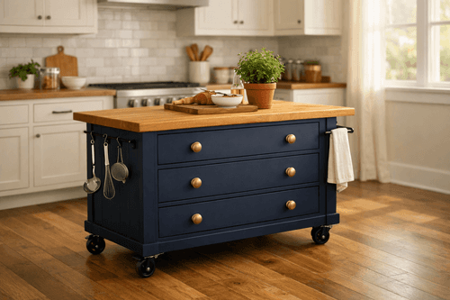
Sometimes the most dramatic room transformations come from the smallest changes, and nothing proves this better than introducing bold, joyful colors that instantly shift the entire energy of your space. I discovered this magic three summers ago when I added a single coral throw pillow to my neutral sofa and watched the whole room come alive – suddenly everything felt more vibrant, more welcoming, more like the kind of place where good things happen. The beauty of using bold summer colors lies in their ability to create instant mood elevation without major commitment or expense; these aren't permanent changes, they're seasonal celebrations that can evolve with your style and the calendar. Whether your home tends toward safe neutrals or you're already comfortable with color, strategic pops of coral, turquoise, or sunny yellow can make any space feel like it's been touched by summer sunshine. The trick is knowing where and how to add these energizing hues so they feel intentional and sophisticated rather than overwhelming or chaotic.
Color Inspiration
- Coral Accents: Throw pillows, picture frames, or ceramic vases in warm coral tones ($10-50 each)
- Turquoise Elements: Glass accessories, artwork, or decorative bowls in ocean blues ($15-60 each)
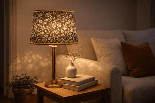
- Sunny Yellow Pops: Lamp shades, fresh flowers, or accent lighting in cheerful yellow ($8-40 each)
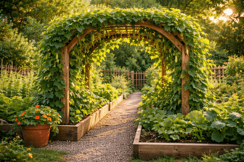
- Tropical Greens: Plants, textiles, or wall art in vibrant lime or emerald ($12-80 each)
- Bold Textiles: Throws, curtain tiebacks, or table runners in statement colors ($20-100 each)
- Colorful Art: Photography, prints, or paintings featuring bold summer hues ($25-150 each)
- Accent Lighting: Colored lampshades or string lights for warm ambiance ($15-75 each)
- Fresh Florals: Seasonal bouquets in vibrant summer colors ($10-30 weekly)
Color Strategy
- Start with one bold color as your primary accent throughout the space
- Add your chosen color in three different areas for visual balance
- Vary the scale from small accessories to medium statement pieces
- Layer in a complementary second color sparingly for depth
- Ground bold colors with plenty of neutral elements to avoid overwhelm
- Consider lighting when placing colorful elements for maximum impact
- Test combinations by gathering items together before final placement
- Refresh seasonal colors as your mood and the weather change
Professional interior designers follow the "80-20 rule" when adding bold colors: 80% of your room should remain neutral, with bold colors comprising only 20% of the visual weight. This prevents color overwhelm while maximizing impact. The secret is using your bold color in the "triangle rule" – place it in three spots that form a triangle when you scan the room, creating visual flow and balance. Also, choose colors based on your room's natural light: coral and yellow work beautifully in north-facing rooms that need warmth, while turquoise and tropical greens are perfect for south-facing spaces with abundant natural light. Remember, you can always add more color, but it's harder to tone down a space that's gone too bold.