


Color Shock Therapy: Add a Bold Statement Piece
Transform your neutral room from boring to brilliant with one fearless color choice that changes everything!

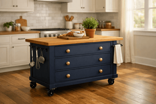
Neutral rooms are safe, sophisticated, and let's be honest – sometimes soul-crushingly boring. If you're tired of your beige-and-gray sanctuary feeling more like a waiting room than a home, it's time for some color shock therapy! I've transformed countless bland spaces with this simple strategy: pick one piece of furniture, paint it an outrageously bold color, and watch your entire room come alive. The best part? This approach costs under $50 and takes just a weekend, but the impact is so dramatic that guests will think you hired a designer. It's like adding a shot of espresso to your morning coffee – suddenly everything feels more energized and intentional.
What You'll Need
- Target Piece: One substantial furniture item (dresser, bookshelf, accent chair, or side table)
- Paint Supplies: High-quality primer (~$12), bold paint color in satin finish (~$15), brushes and rollers
- Prep Materials: Sandpaper (120 and 220 grit), tack cloth, drop cloths, painter's tape
- Coordinating Accessories: 2-3 smaller items in complementary colors (~$20-40 total)
- Finishing Touches: New hardware if needed, protective topcoat for high-use pieces
- Color Inspiration: Paint swatches, magazine clippings, or Pinterest board for confidence
Step-by-Step Method
- Choose your hero piece – pick something visible but not overwhelming (20-30% of wall space maximum)
- Select your bold color using the 60-30-10 rule: your room stays 60% neutral, 30% gets color echoes, 10% is pure drama
- Prep your furniture by cleaning thoroughly, sanding lightly, and priming for maximum color payoff
- Paint in thin, even coats – two to three coats of quality paint beats one thick, streaky coat
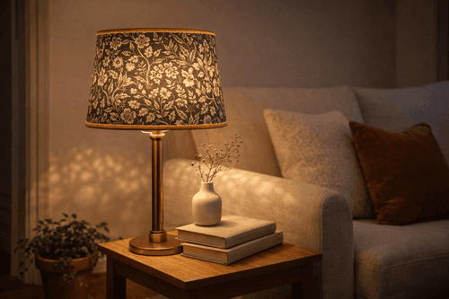
- Echo your bold color in 2-3 smaller accessories: throw pillows, artwork, or decorative objects
- Balance the drama by keeping 80% of your room neutral – let your statement piece be the star
- Layer in complementary colors sparingly – think analogous or triadic color schemes for sophistication
- Step back and assess – add or subtract accessories until the room feels intentional, not chaotic
Professional designers always test paint colors in different lighting conditions before committing. Paint a large sample board (at least 2x2 feet) and live with it for a week, observing how it looks in morning light, afternoon sun, and evening lamplight. Also, consider the psychology of color – warm colors (coral, orange, yellow) energize spaces, while cool colors (turquoise, navy, emerald) create calm focus. Choose based on how you want to feel in the room!